Al Attal
- Role
- Visual identity system (grid, colours, type) + rebuilt social media accounts + advertising content and carousels
- Year
- 2025
- Country
- Egypt
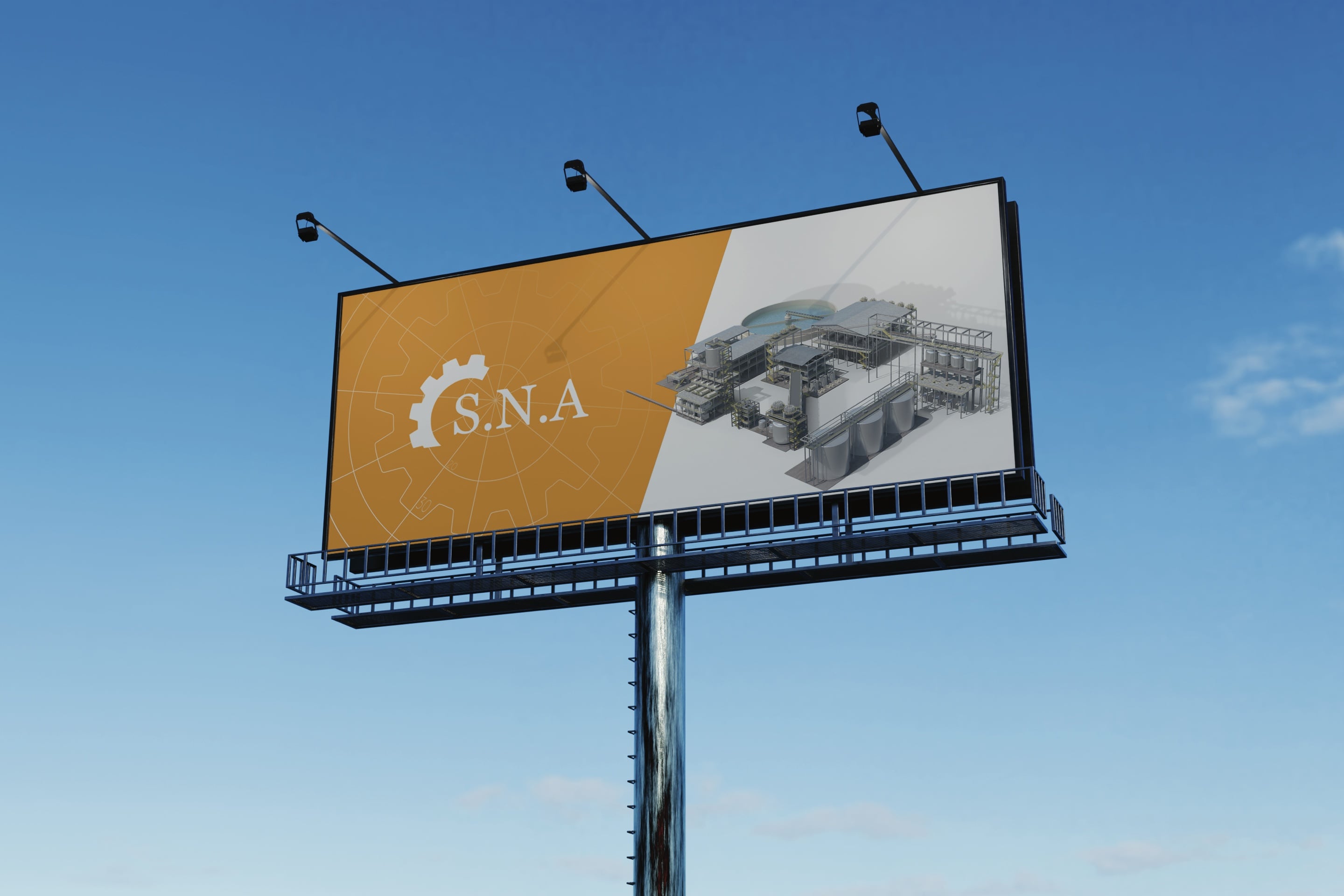
The idea
My job was never to "beautify" the brand. It was to rebuild it on the same logic as the machines it makes: precision that doesn't negotiate, and a system that doesn't allow deviation.
Context
30 years. 4 countries. Production lines measured in microns. That is Al Attal's legacy in the industry.
But the identity carrying that name was run on a completely different logic: guesswork, not standards.
The problem
Al Attal has 30 years of experience across 4 markets (Egypt, Saudi Arabia, Iraq, Turkey), yet its identity ran on the opposite logic to its experience, its engineering and the quality of its products:
- Every country used a different version of the logo and colours, with no single standard.
- Advertising content appeared as disconnected pieces, with no system or consistent visual language.
- The social media accounts showed complex engineering products in a scattered, conventional way that made them hard for customers to grasp quickly, so they ignored the posts.
A procurement engineer evaluating a million-dollar production line sees a visual contradiction, and reads it as risk, not as a cosmetic detail.
The solution
I didn't just design a new logo. I built a visual engine: a strict, non-negotiable system, built on the same precision logic as the machines themselves:
Visual identity
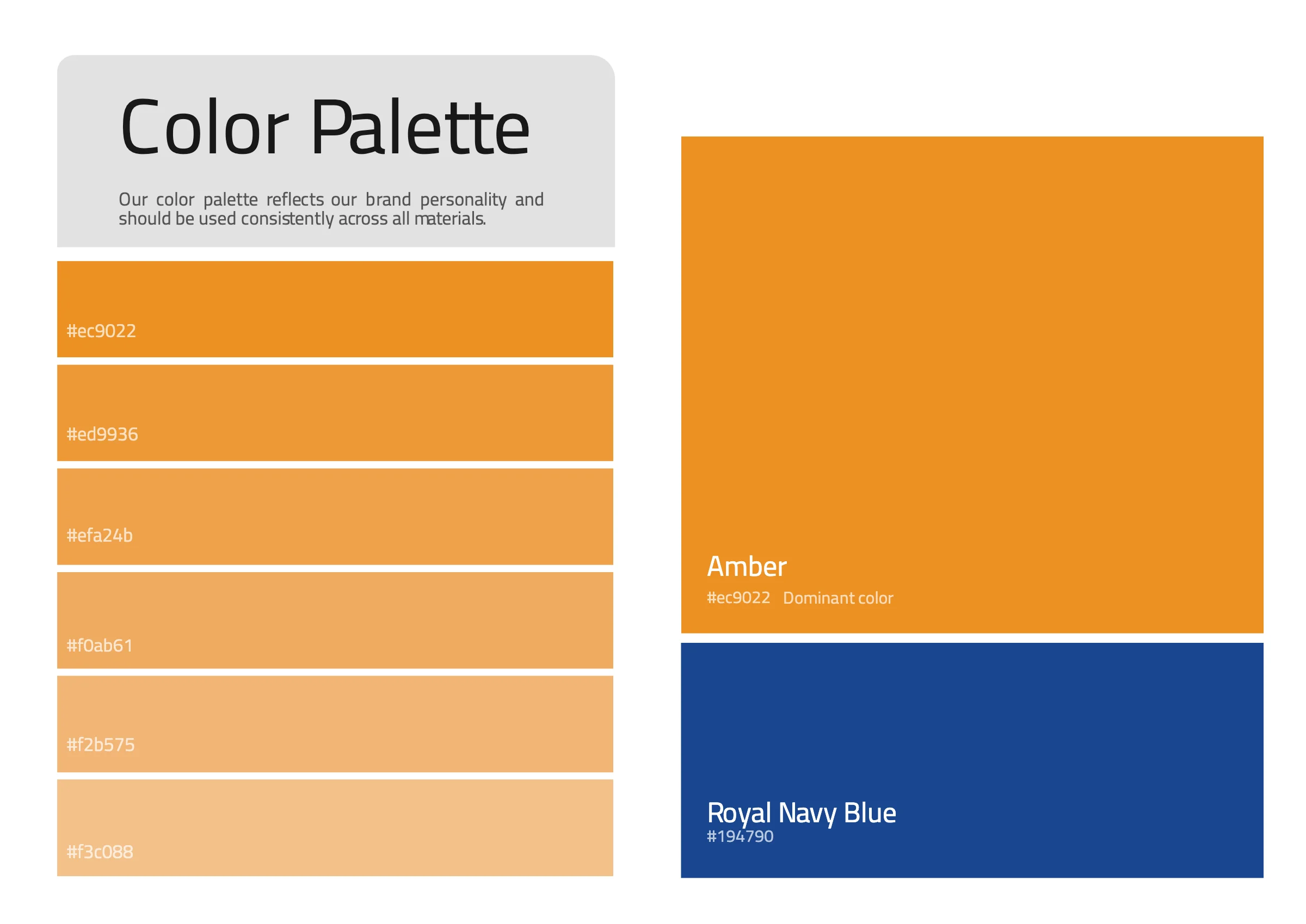
Colours
Amber #ec9022
Royal Navy Blue #194790
A unified palette (industrial amber / deep navy) carrying the same sense of energy and reliability in every market.
Typeface
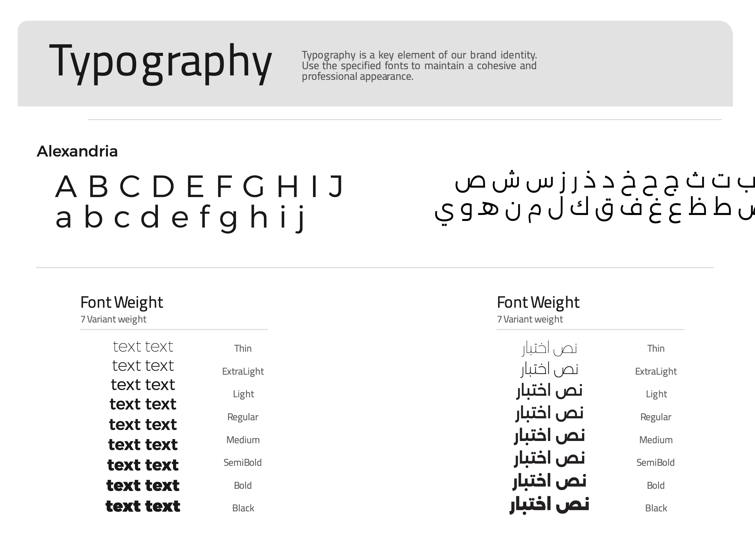
Alexandria
- Thin
- ExtraLight
- Light
- Regular
- Medium
- SemiBold
- Bold
- Black
A single typographic system that simplifies complex technology across carousels and advertising.
From the brand guidelines
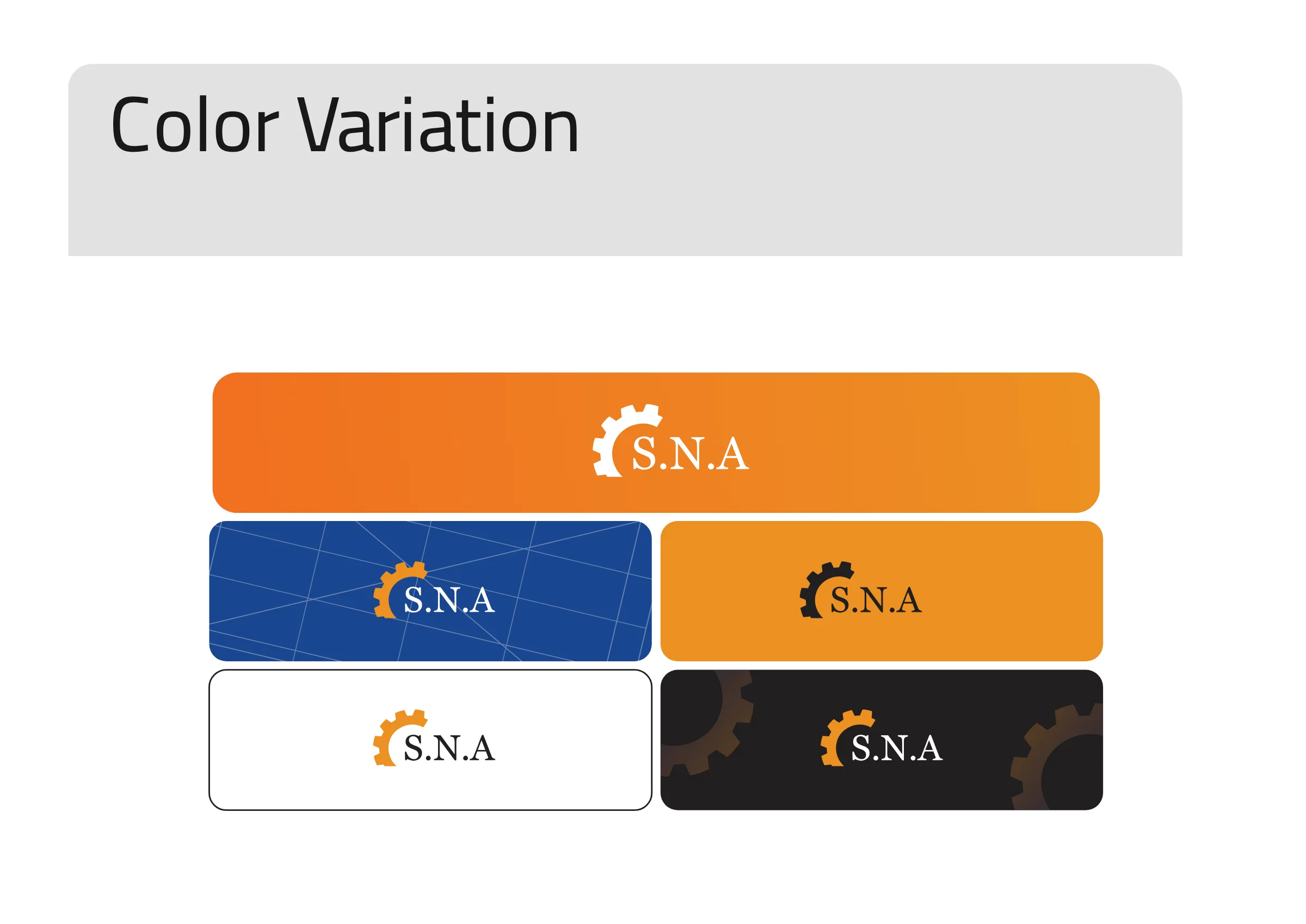
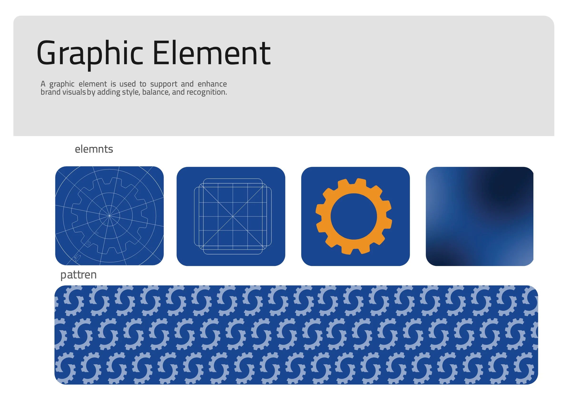
A fixed engineering grid applied to every output, in every country, without exception.
Applications
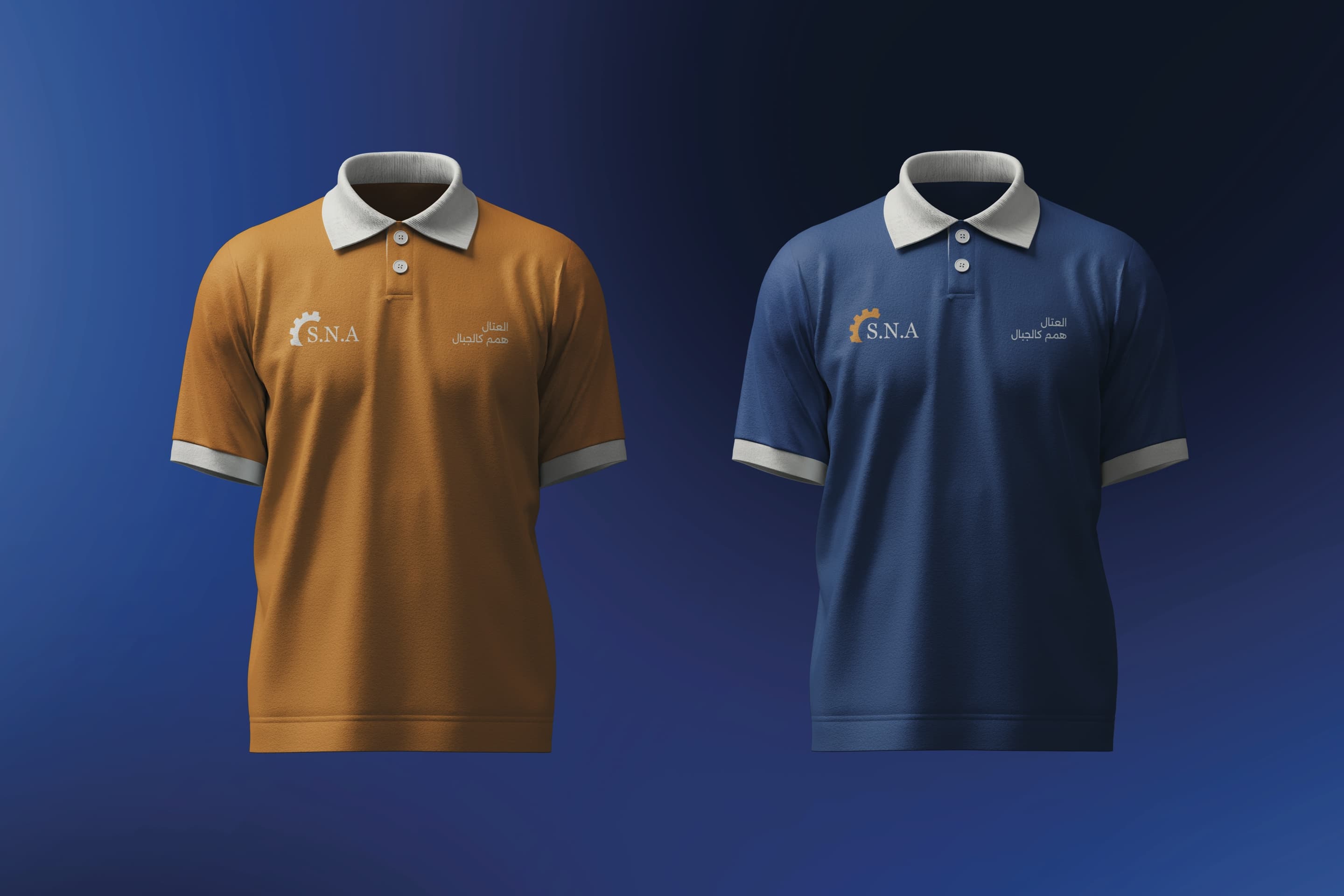 Concept
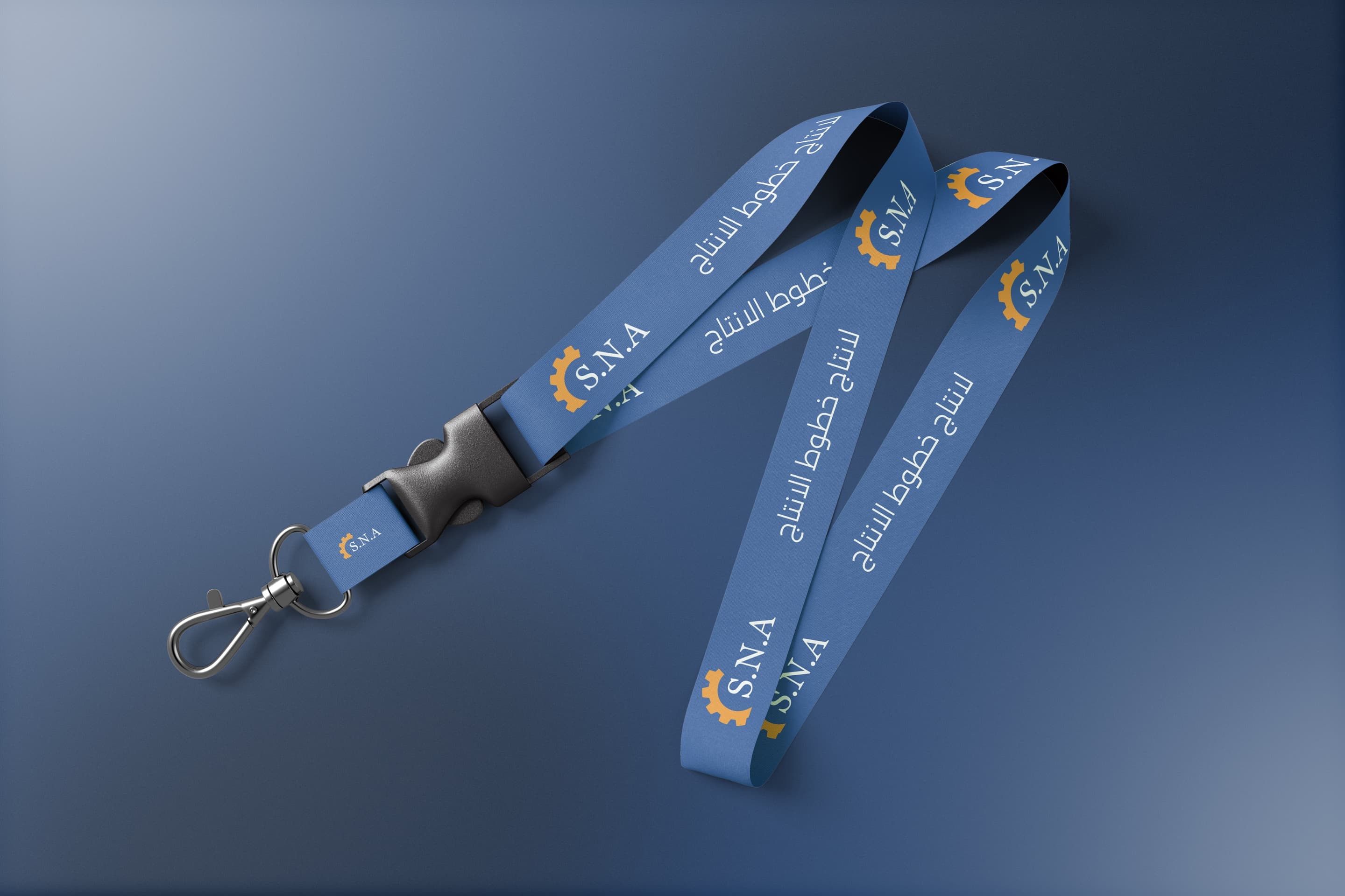 Concept
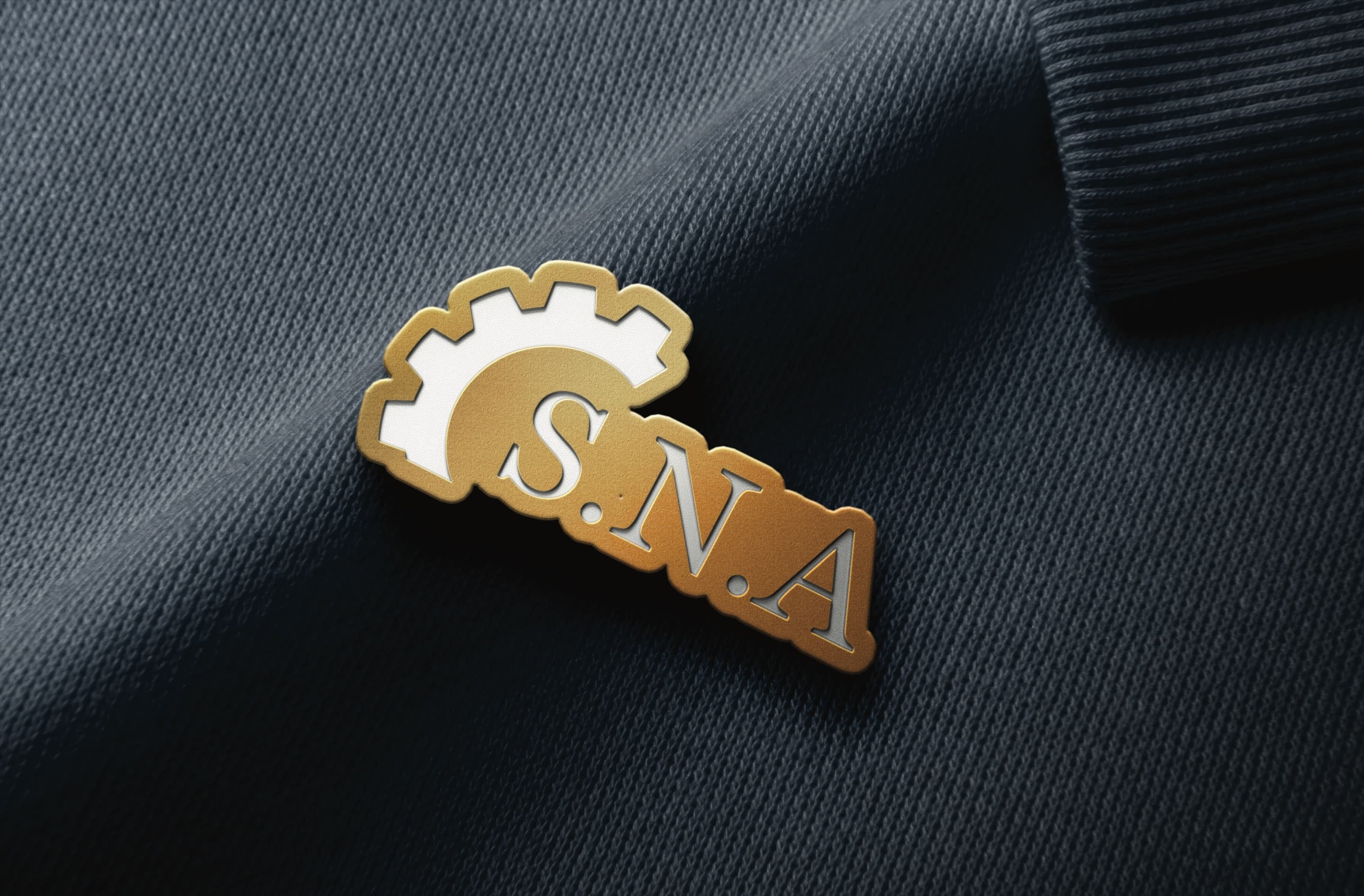 Concept
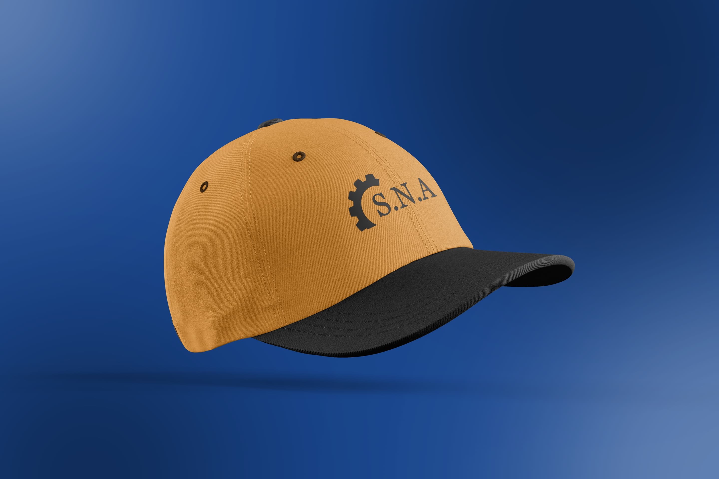 Concept
One grid. Any output, any country, no exceptions.
Posts & social media accounts
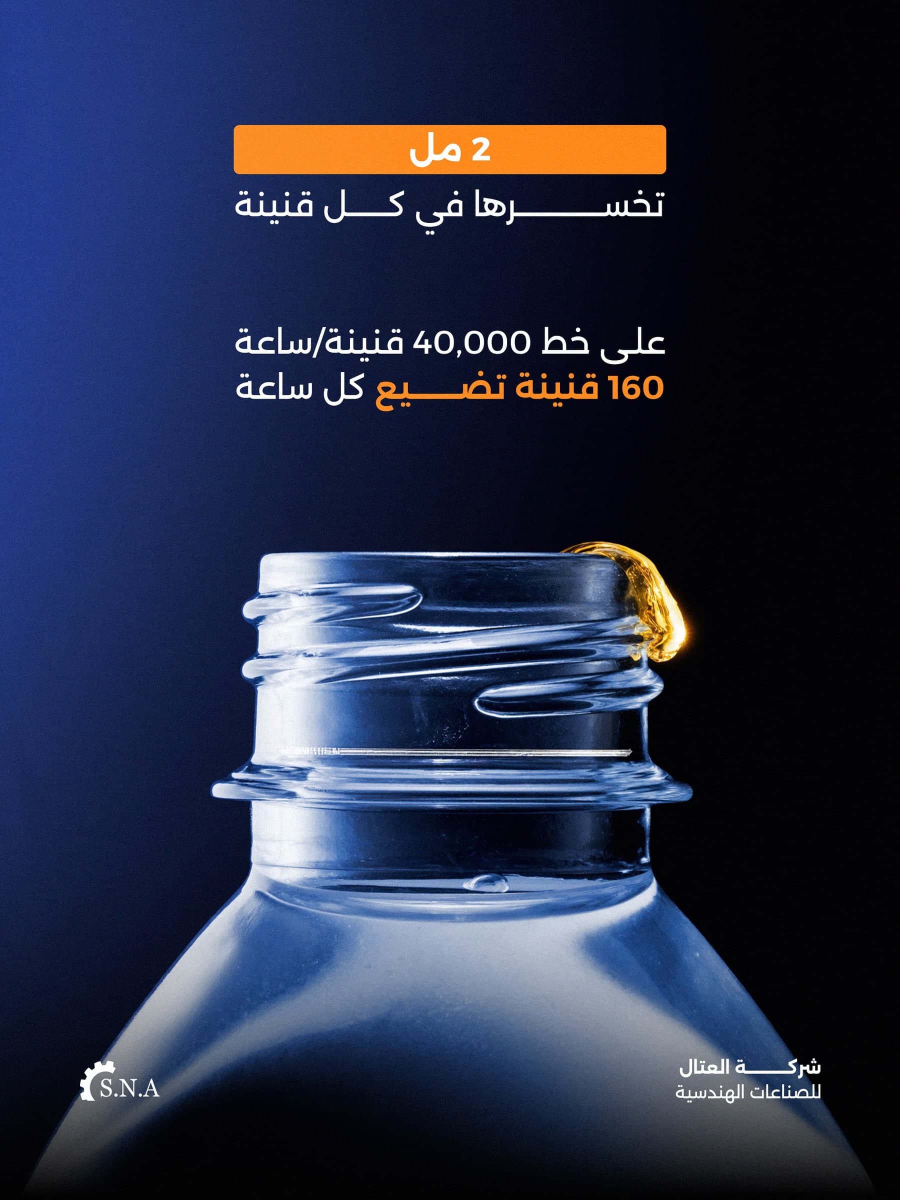
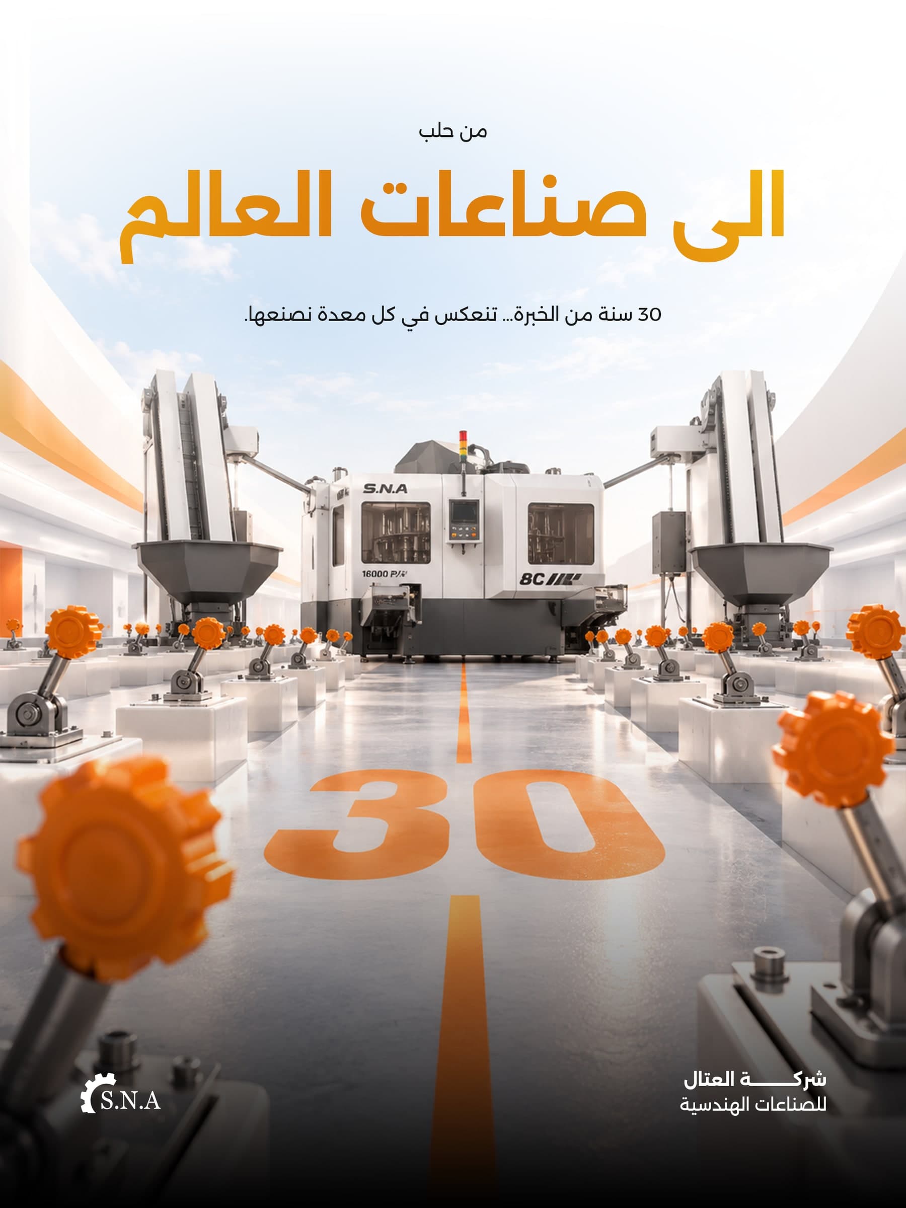
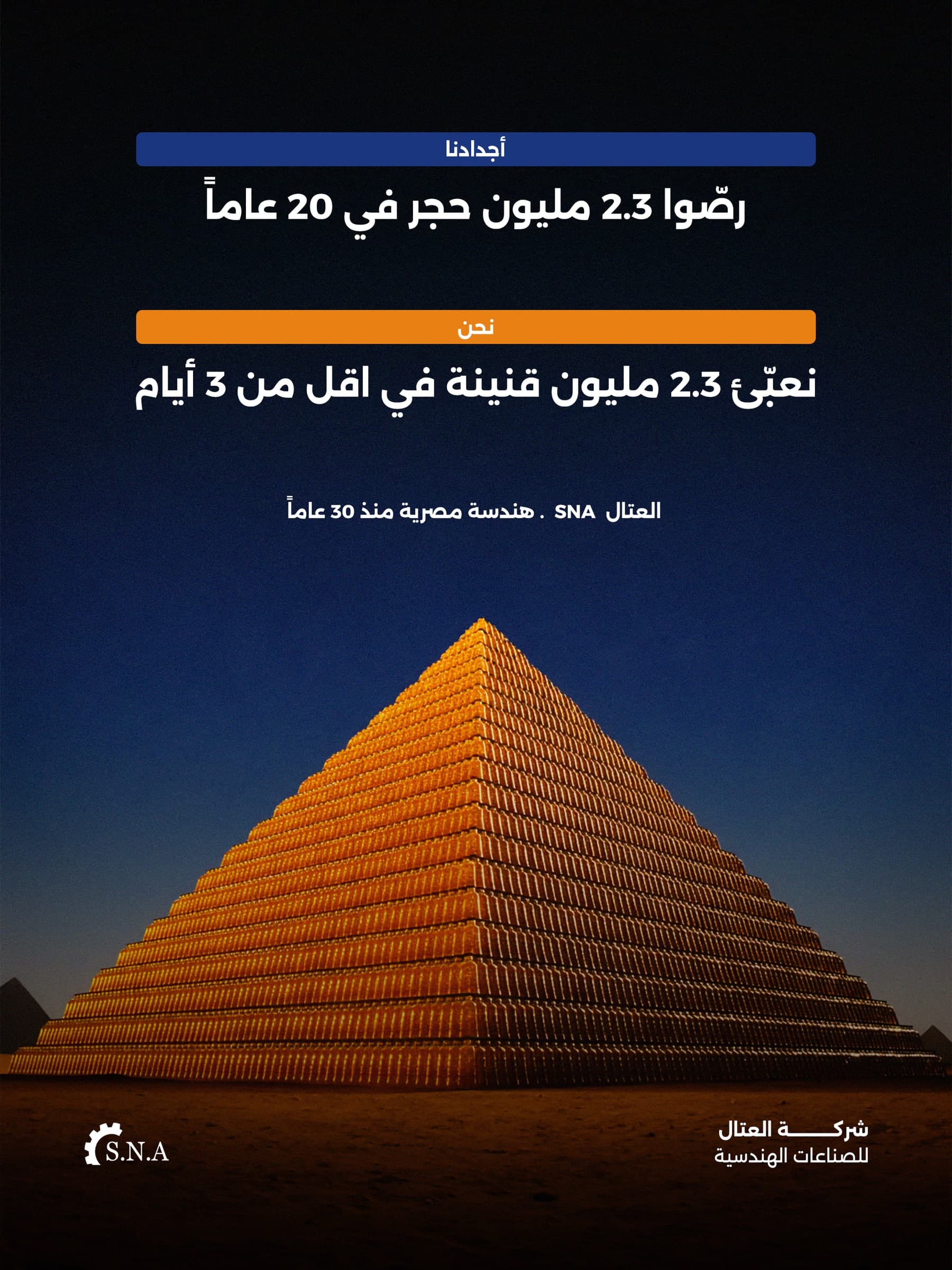
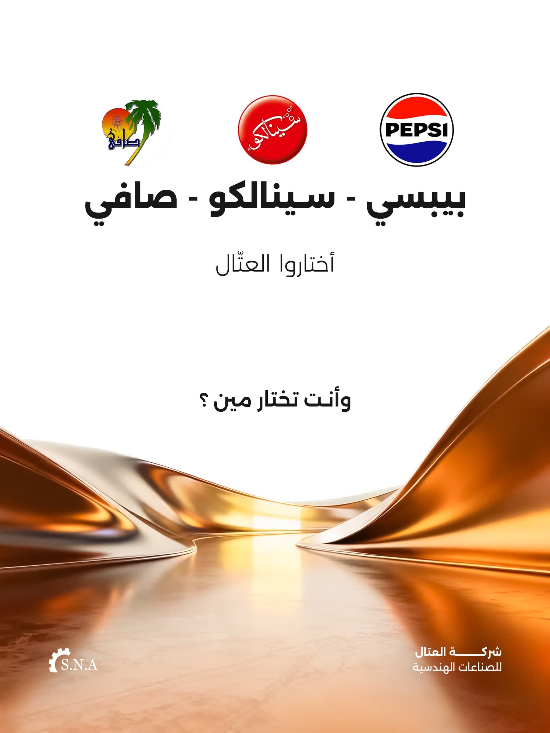
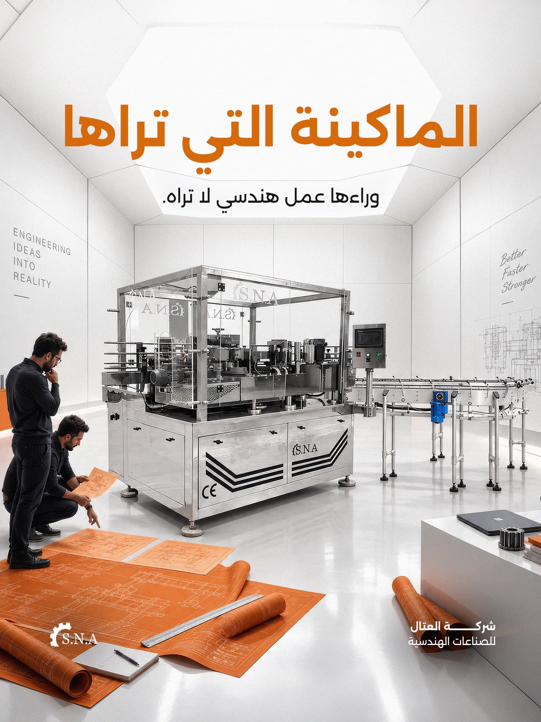
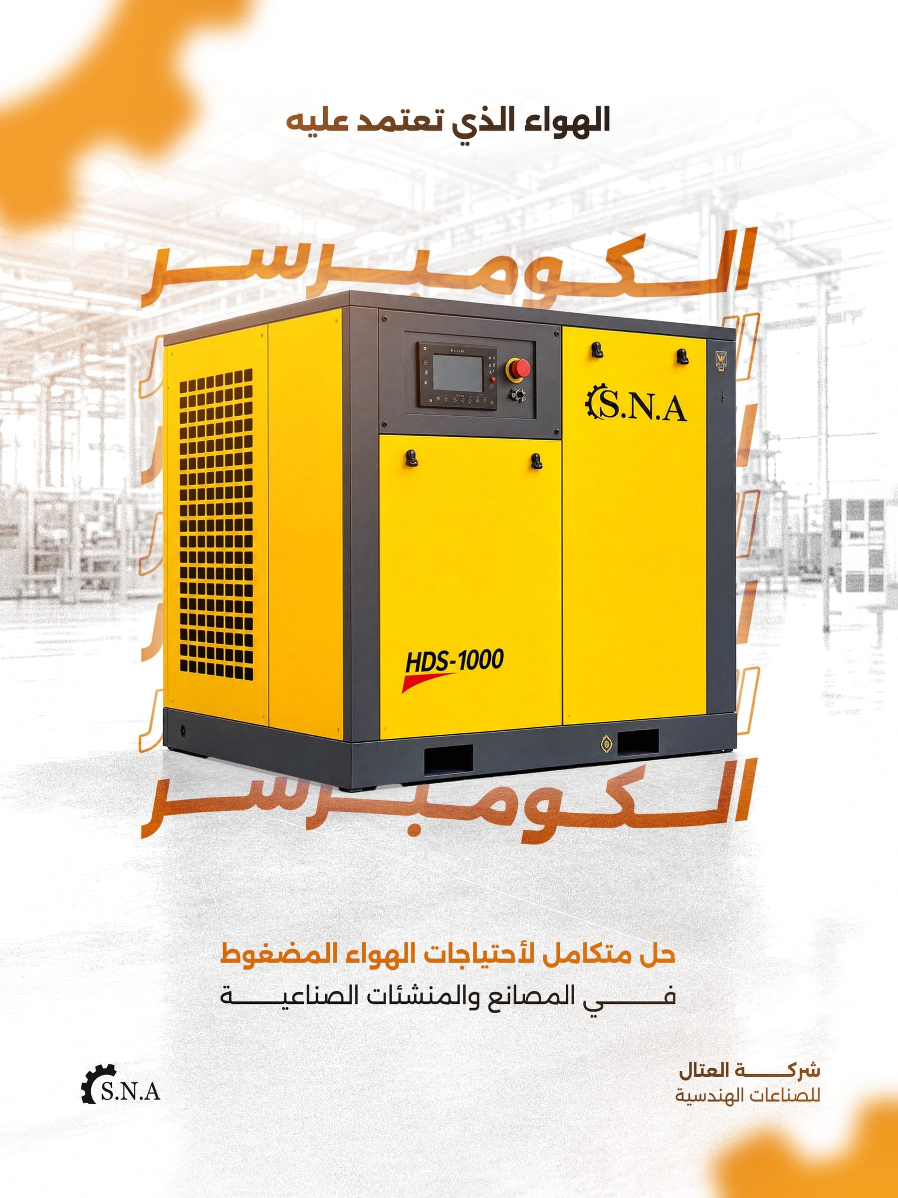
Rebuilt social media accounts that present technical products with instant clarity, instead of scattering them.
What changed
- One identity across every platform and account, consistent in every country.
- A new position built into the system: from "a local machinery factory" to "the reference point the rest of the industry is measured against."
- A system that can produce hundreds of outputs (posts, catalogues, content) without reinventing the identity each time.
- An ongoing partnership since 2025.
When every touchpoint stops contradicting itself, the client stops comparing. And starts choosing.
Tell me where it's falling short
Answer five short questions. WhatsApp opens with your answers ready, and I reply personally.